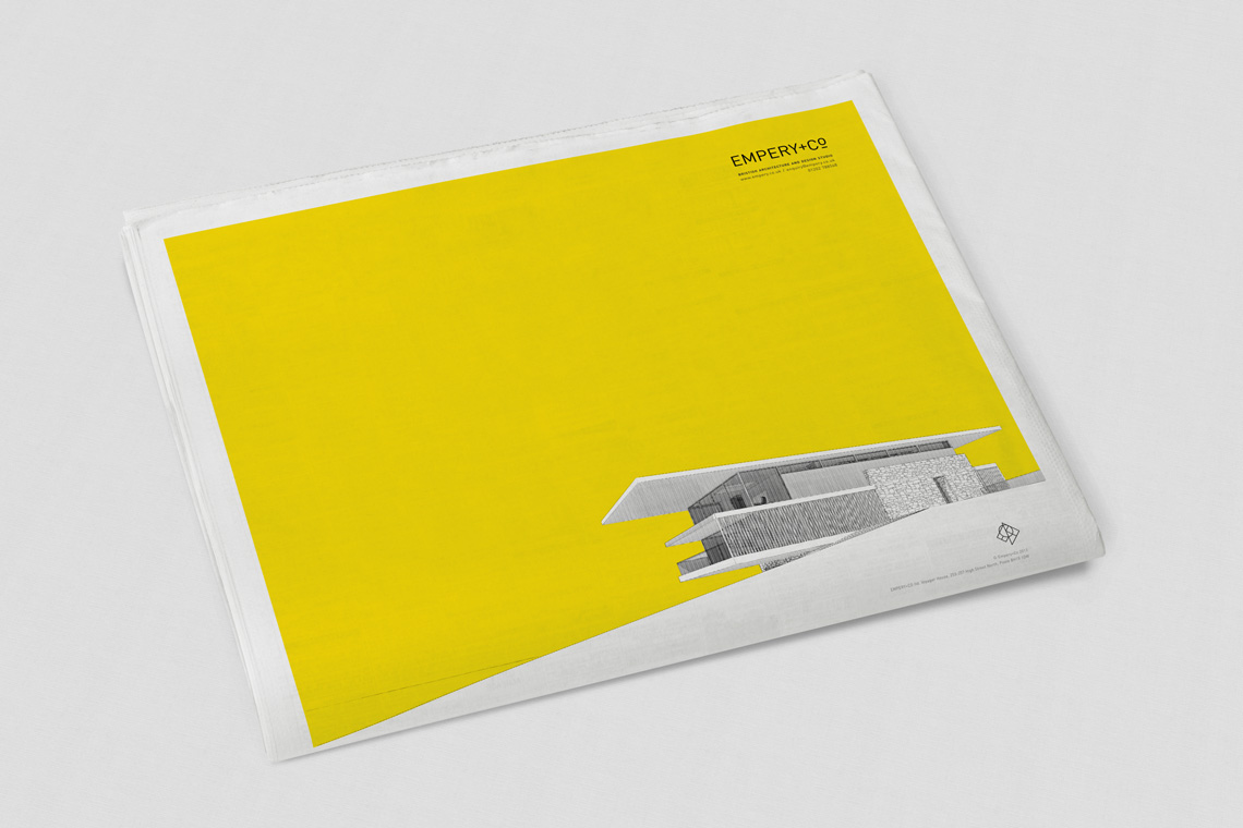
Empery+Co
British Architecture and Design Studio
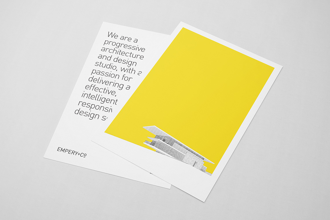
The name Empery came from the winning horse of the 1976 Epsom Derby, the same year Toby Peters - managing director and lead architect of Empery was born. It's a lovely origin story. A devoted architect, Toby has crafted a wealth of houses across Sandbanks and the Dorset coast.
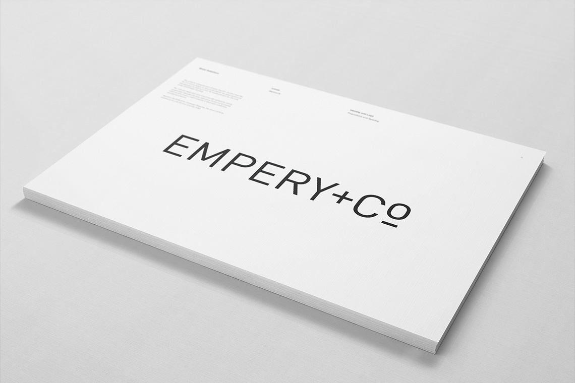
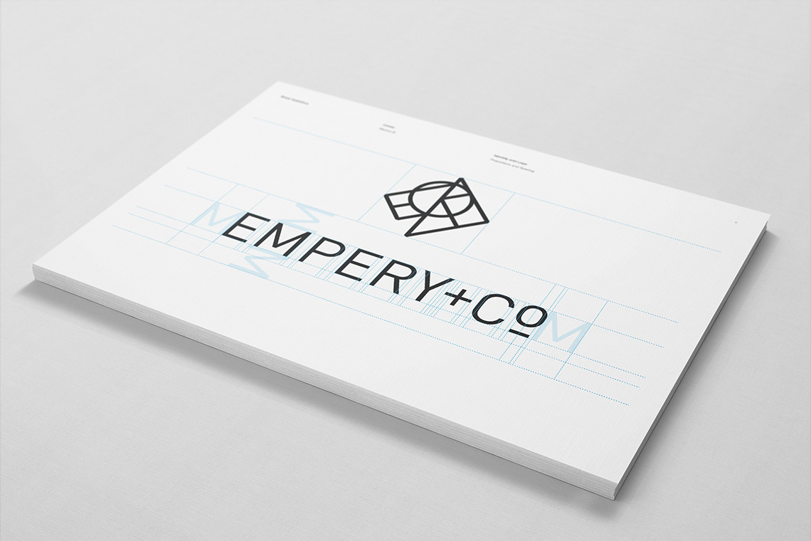
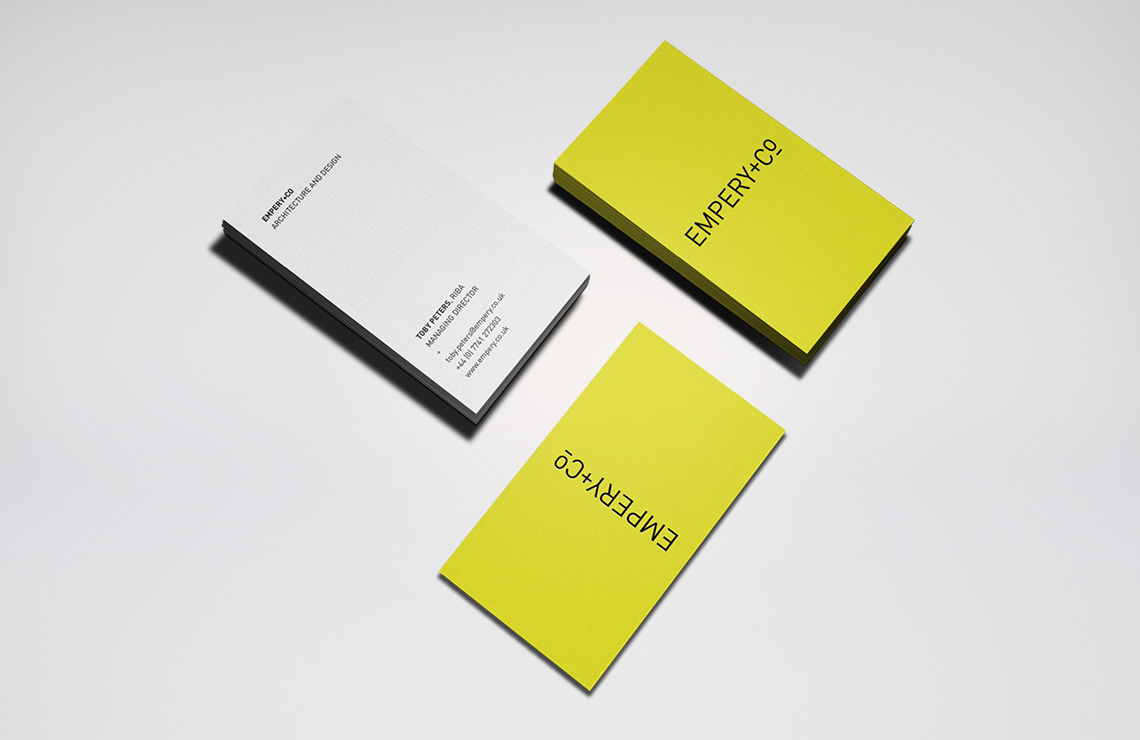
Din's absence of personality makes it an effective canvas for a logotype, the clean structured lines make it a clear fit for an architect. Emphasising these clean lines, a plus sign and custom-made superscript to the Co add an iconic twist without resorting to the flourish of an ampersand.
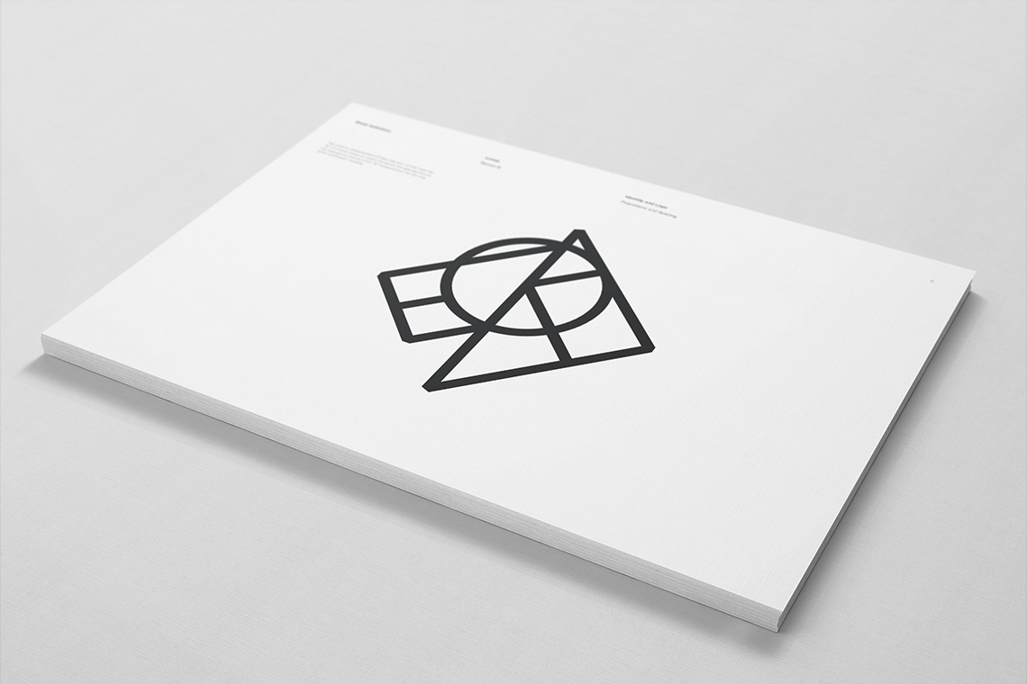
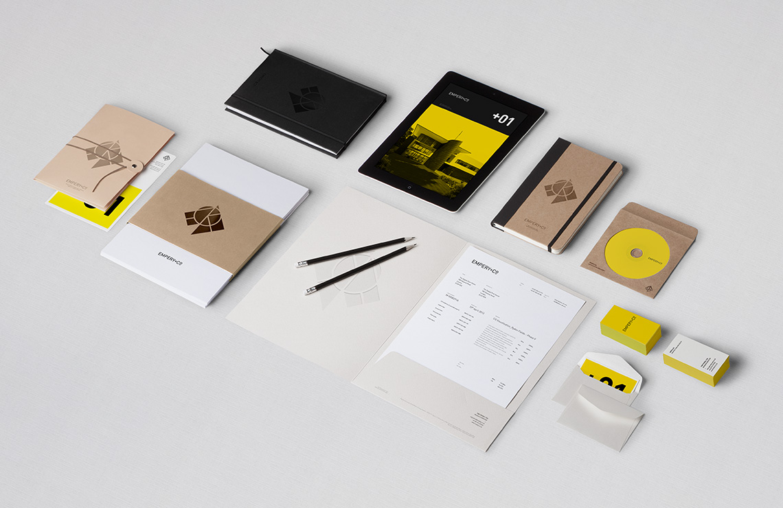
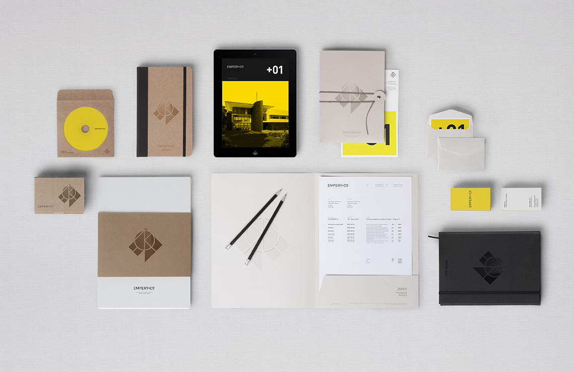
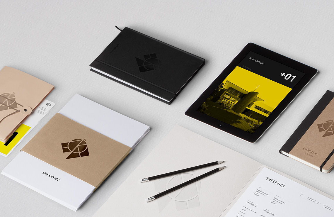
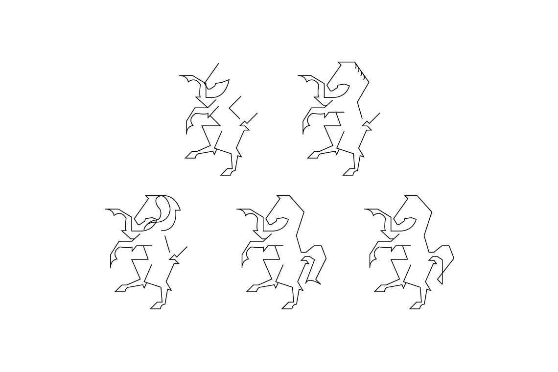
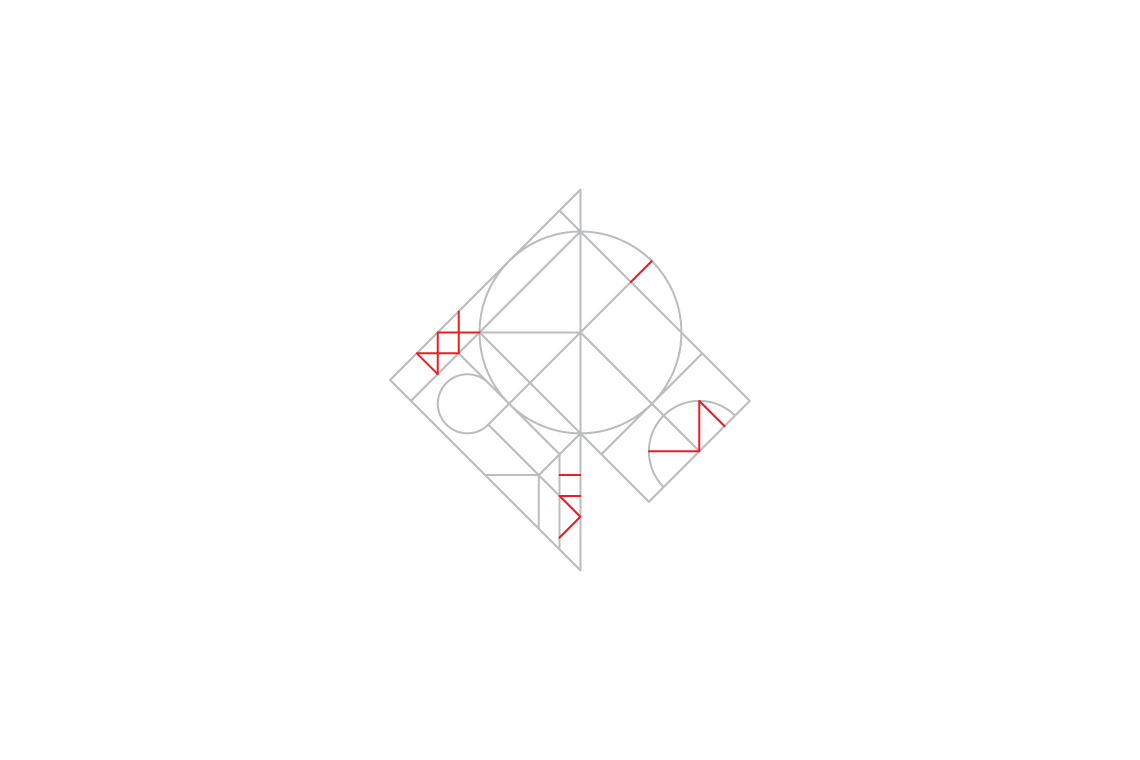
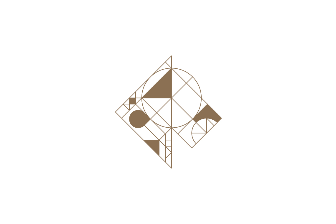
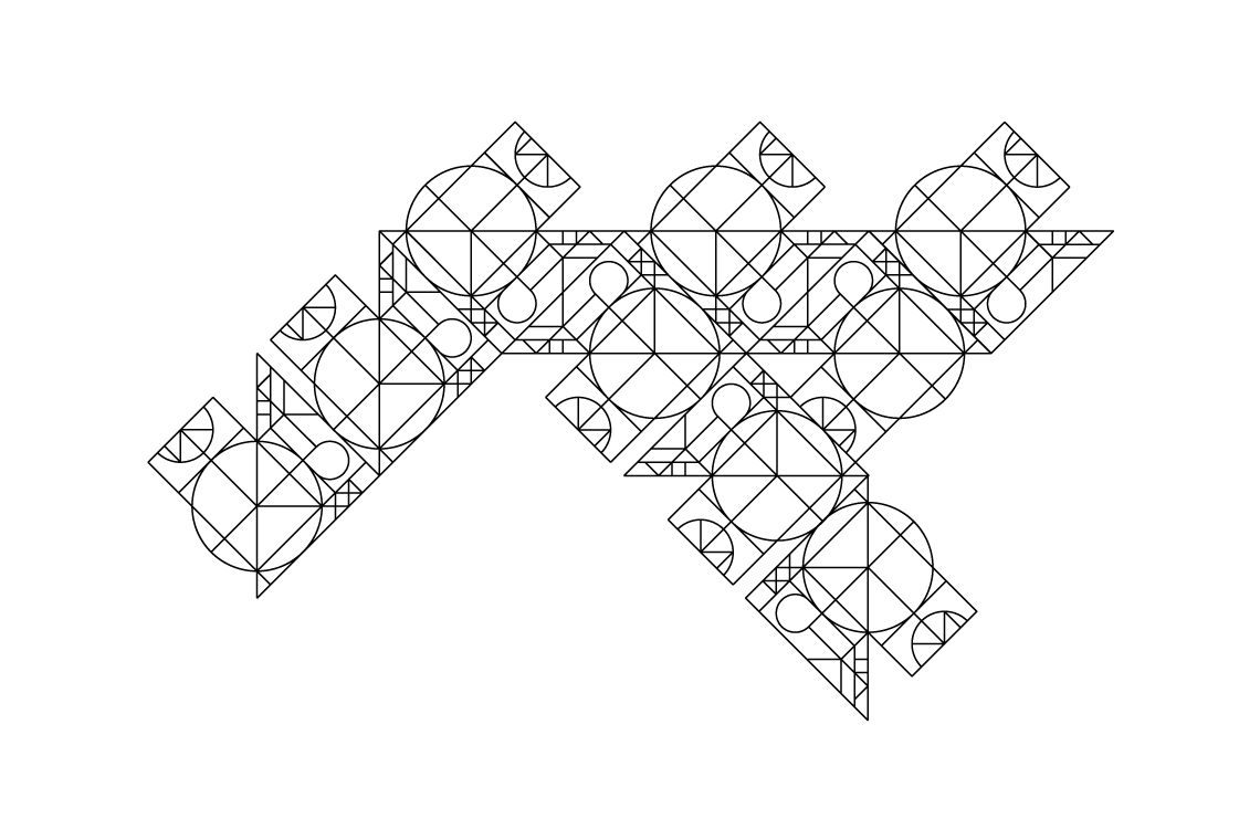
Based on the same clean lines as the logotype the direction for the icon was first conceived when simplifying a horse's head to a square, circle and oblong.
From the sketchbook:
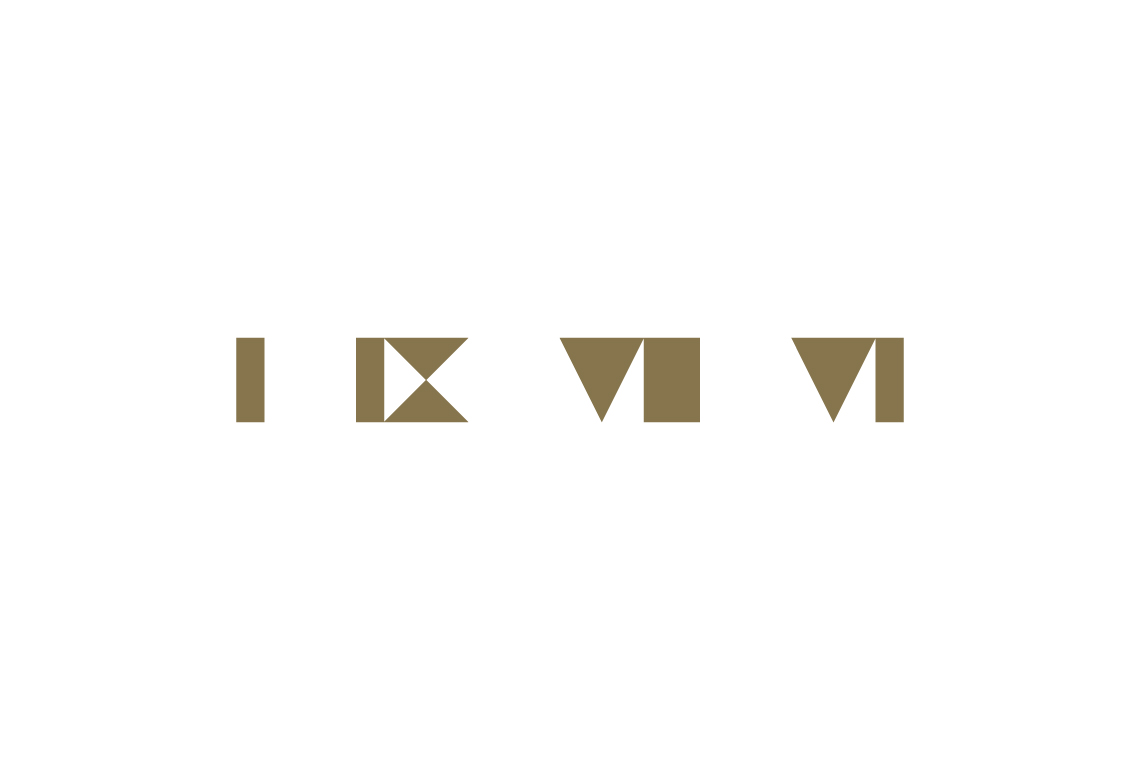
Creating the horse graphic wasn't that easy, I explored a number of directions before finding one that befitted the company's personality. The early version of the final style was originally much more complicated in design - this was done to include the roman numerals for 1976, a lovely touch but had to be cut.
Made in Scotland
Bred in Wales, educated in Cornwall and working in England. Living among the cafés, coffee shops and clichés of Christchurch. Plumen light bulbs dangle in pendants above the dining room table, Bertoia diamond chairs are draped in fur throws and a rosewood Eames lounger is home to an owl shaped cushion with button eyes. I’ve operated under the guise of a designer since 2008, dabbling in the ink, pixels and vectors of brand and building between the parentheses of web development.
For those of you who prefer picture books and colouring outside the lines.
Download Something Sensible [PDF]
For the more discerning connoisseur who can spell connoisseur without a google search.
